‘Lollipop is the biggest and the mightiest of all OS updates, and takes UI smoothness and overall speed to a whole new level.’
It’s here. Ever since it’s birth in 2003, Android has been growing leaps and bounds. As of today, we have ‘the next iteration’ of the most acclaimed and used OS in the world. Android being ‘the most’ versatile OS among it’s rivals, recently got a much needed upgrade, to Android L (or Android Lollipop) which stands for version 5.0, partially, if not completely. This upgrade is quite unlike any other ones we’ve come across over the years in Android. Google has revamped the design philosophy and that, has given birth to ‘Material design’.
As mentioned, Android L is not out yet to all the smartphones out there. Google has been kind enough to push out previews of the same. Thus, app developers can keep a check on how their applications might look like on this iteration. This way the apps can be ready when it is officially out over the air. After it’s announcement at Google I/O 2014 in June this year, as promised, Google had released a series of developer previews that gave a sneak peak on what the ‘next big thing’ in Android would please us with. Folks who have Nexus 4, Nexus 5 and Nexus 7,the Moto line-up as also GPE devices have received the final update as promised by the tech giant. Meanwhile, we can see various unofficial ports for other flagship devices like HTC One M7 and even Galaxy S4. Users can flash the images to get a taste of the revamped design. (Things are easier if you’ve got root privileges. Do it only if you are very much eager to experience the material eye candy, like me.Or you can just wait till the final build is out for you via OTA updates 😛 )
The ‘Material’ overhaul
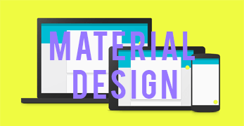
Android Lollipop is considered the biggest and the most significant upgrade to Android. This upgrade is much more significant than the transition to the Holo UI from Gingerbread, that we see right now with Jellybean and KitKat builds. This release, as described earlier, in particular marks the usher of ‘Material Design’. It is the design language with the use of which Google aims to unify the user experience across all of the Google products (Google watch, Google player, Google Car, Mobile phones, Tablets, Chrome books,etc) and Google apps.
Material Design – The idea
As visualized by Google, it is based on the simple concept of a paper like a material. This material transforms and reshapes itself as per the need across the screen. The idea is to be able to see where everything comes from, and where everything goes. It involves ‘ripple’ touch feedback that exactly shows what we are touching on the screen. The feedback not only shows our selection but also for how long, and what is the result ahead of the touch input. All of this is achieved with smooth, fluid 60 fps animations. Apart from the card styled interface, we can notice the use of striking colours used in every app which makes it more intuitive and fun to use. Designer Matías Duarte explained ;
“unlike real paper, our digital material can expand and reform intelligently. Material has physical surfaces and edges. Seams and shadows provide meaning about what you can touch.”

Cross platform flexibility
More so, one can see the use of this language across all the Google products announced in the recent times. These include smart watches and Google Player. Thus, we can speculate as of today, that a smaller screen doesn’t necessarily have to mean less, it’s just smaller. Mobile devices have been evolving and now we can have a full experience even in a 1.5-inch smartwatch display, just as we can on a 50-inch TV. Material Design makes this possible and the industry recognizes that fact.
The underlying aim is to provide a unified user experience across all the platforms. This multi-platform flexibility and focus on a dynamic UI have won Material Design a gold award for the best contribution to UX, competing against it’s rivals, including iOS 8. The UX Awards have been going since 2011 and only the best software of the year gets to be part of it. And Google has totally nailed it, as it is visually appealing and provides a seamless user experience, wherever you are, whatever device you use. Cherish or perish,it’s here to stay. We love you Google.
What are your thoughts on the material design inception? Do let us know what you think in the comments section below.


